The Missing Element: Layering Texture in Bespoke Interior Design
The Power of Texture in Luxury Interior Design: How the Right Surfaces Transform a Space from Beautiful to Unforgettable
There is a house I visited in Cheshire, maybe eight years ago now, that I still think about. On paper, it had everything. A generous footprint, well-proportioned rooms, good light. The owners had spent a considerable amount on furniture and the colour palette was thoughtful. But when you walked through the front door, nothing happened. It was pleasant. It was correct. It was completely forgettable.
I have walked into hundreds of rooms in my career and I can tell you in the first ten seconds whether a space is truly working. That house in Cheshire was not working, and I knew exactly why. Every surface was doing the same thing. Smooth walls, smooth floors, smooth cabinetry. There was nothing for your eye, or your hand, or your nervous system to actually land on. The room had no grip.
That is when texture is missing. And once you learn to see it, you cannot unsee it.
What We Actually Mean When We Talk About Texture in High-End Interiors
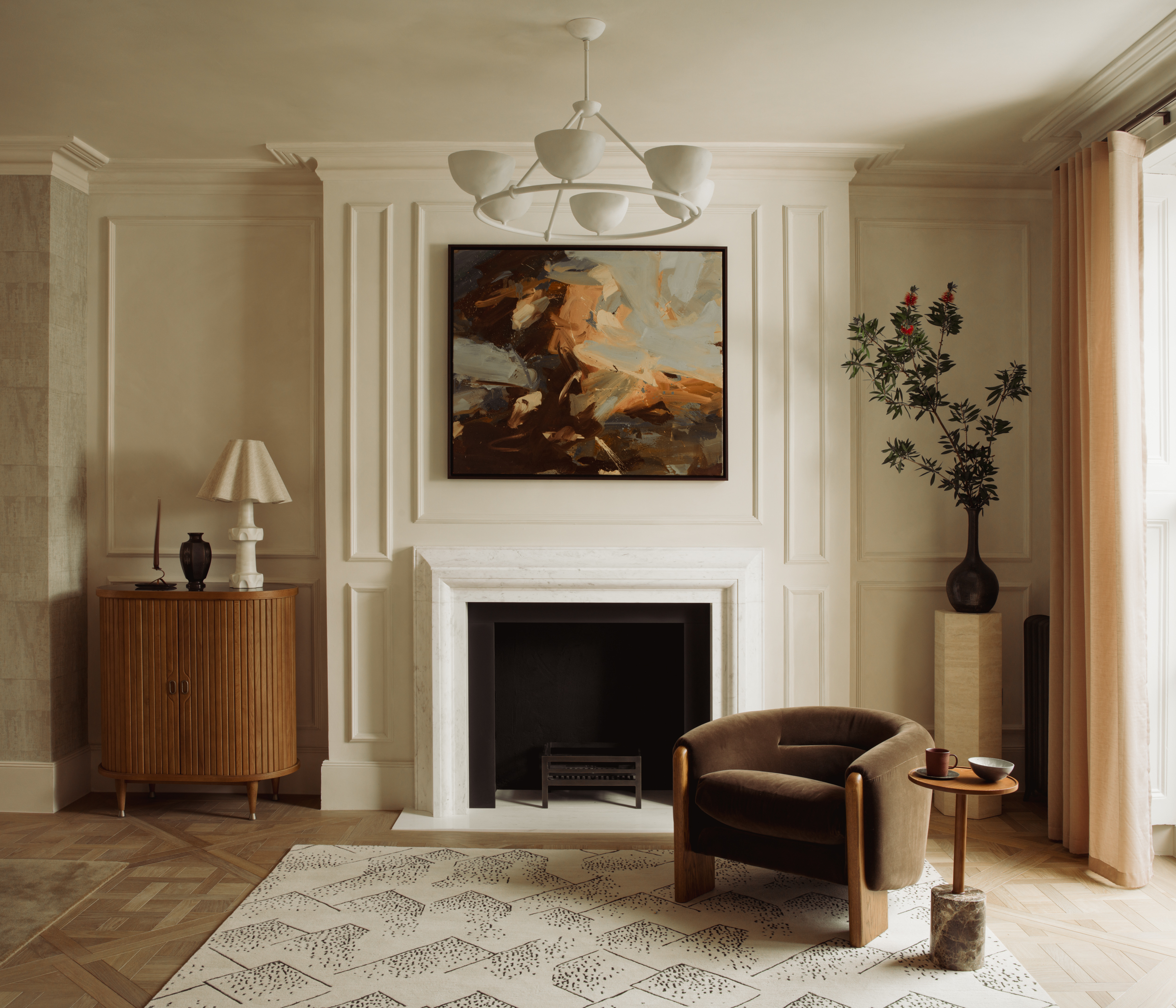
Texture in interior design is not just about tactile surfaces, though that is certainly part of it. It is about visual weight, the way light behaves across a surface, and the contrast between materials that makes a room feel considered rather than assembled.
Think about the difference between a flat-painted wall and one finished in a textured render or a hand-applied limewash. Both are walls. Both can be the same colour. But the limewash catches afternoon light in a way that shifts throughout the day, creating movement and depth that no flat emulsion ever could. That is texture doing its work.
When I talk about texture with our interior design clients, I am talking about the full sensory conversation happening in a room. The roughness of a natural stone against the smoothness of polished brass. The warmth of an oak-panelled wall beside the cool stillness of plaster. These contrasts are not accidental in spaces that feel exceptional. They are deeply deliberate.
The Moment I Understood What Was Actually Going On
As a child, I visited a farmhouse in the north of England. The kind of place with flagstone floors worn smooth by two hundred years of foot traffic, deep-set windows with thick plaster reveals, and timber beams that had absorbed so much history they felt almost alive. I did not know it then, but that house was my first education in texture.
Every surface had character. The walls were not uniform. The floors were not consistent. Nothing matched in the way a showroom matches, and yet the whole thing felt extraordinarily coherent. It felt real. It felt like a place.
Years later, when I founded TXTURED and started working on home renovation projects across Cheshire, Hale and Bowdon, I kept returning to that farmhouse as a reference point. Not aesthetically, but principally. The principle was this: when a space has textural variety, it has life. When it does not, it falls flat regardless of how much money has been spent on it.
Why Period Homes Get It Right (and What New Builds Can Learn)
One of the greatest privileges of working in period home renovations is that the buildings themselves already understand texture. Victorian stone facades, Edwardian cornicing, original timber floors with all their irregularities. These properties have a material richness built into their bones.
The challenge, and it is one I genuinely love, is honouring that richness while creating interiors that feel entirely current. Too often I see period homes in Wilmslow and Hale where the original architecture has been coated, smoothed and neutralised into something that could be anywhere. The bones are exceptional but someone has poured a bucket of uniformity over the whole thing.
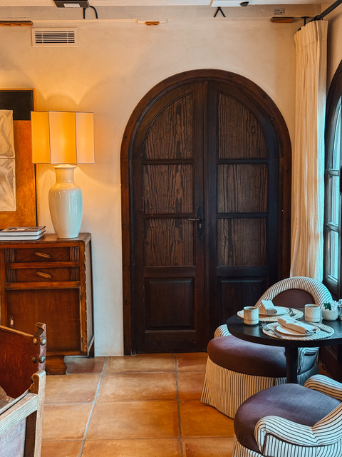
When we approach a period renovation, the conversation about texture starts with the building itself. What are its materials telling us? What are its surfaces asking for? A house with original exposed stonework in the hallway does not want a kitchen finished in high-gloss lacquer. It wants materials that speak the same language. Matte, aged, considered.
That does not mean everything has to be rustic. Some of the most satisfying projects I have worked on have been period homes where we have introduced very clean, contemporary elements precisely because the textural contrast between old stone and new, smooth surfaces creates something genuinely electric. The key is always intentionality.
Starting From Scratch: How TXTURED Brings Texture to New Builds
New builds present a different kind of challenge. Where period homes give you texture to work with and build upon, a new build hands you a blank box. Smooth plasterboard, uniform floors, standard-height ceilings with no architectural detail to speak of. There is nothing wrong with any of that. But it does mean the textural language of the space has to be created entirely from intention, rather than inherited from the building itself.
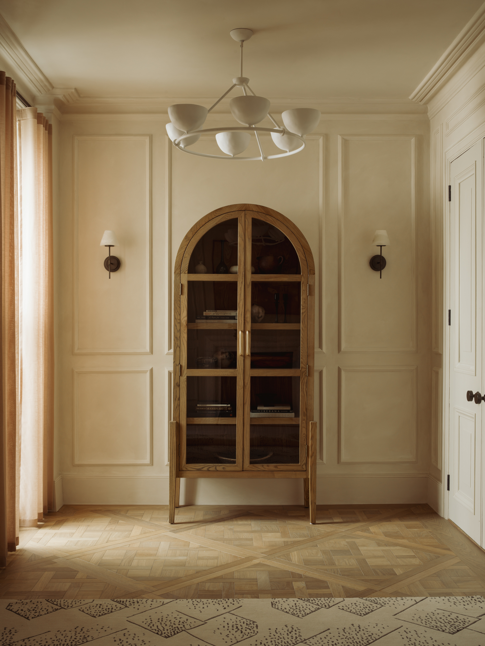
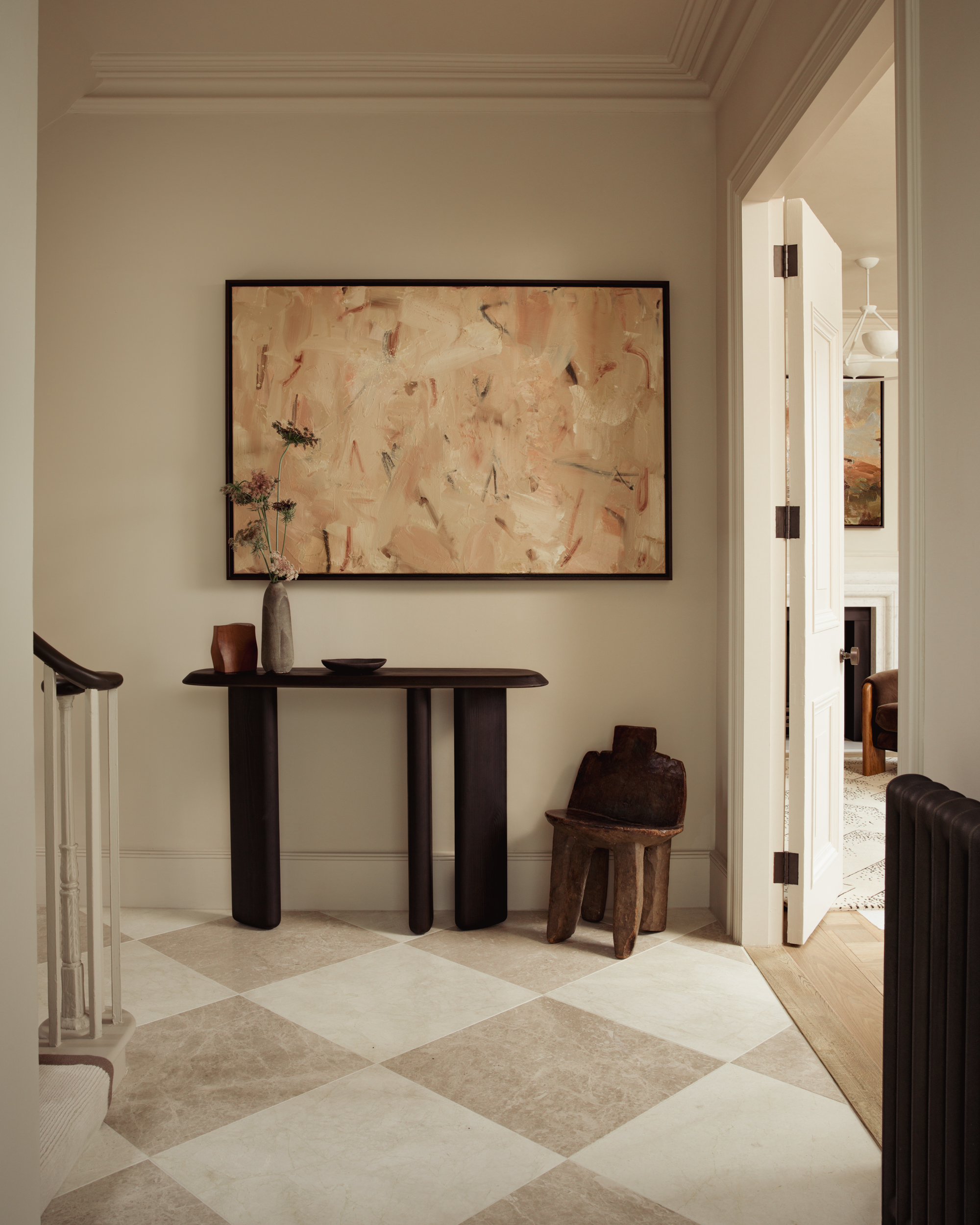
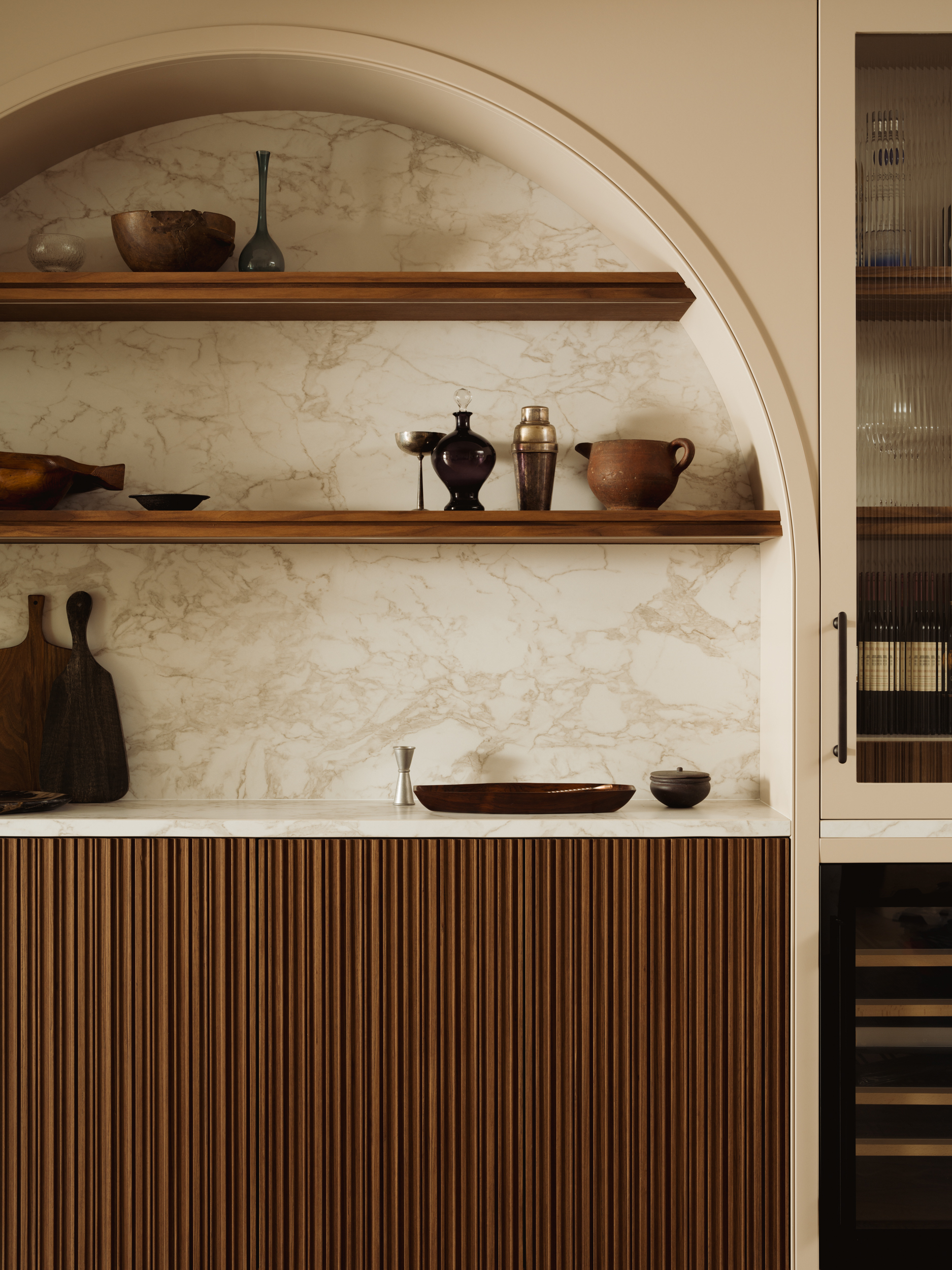
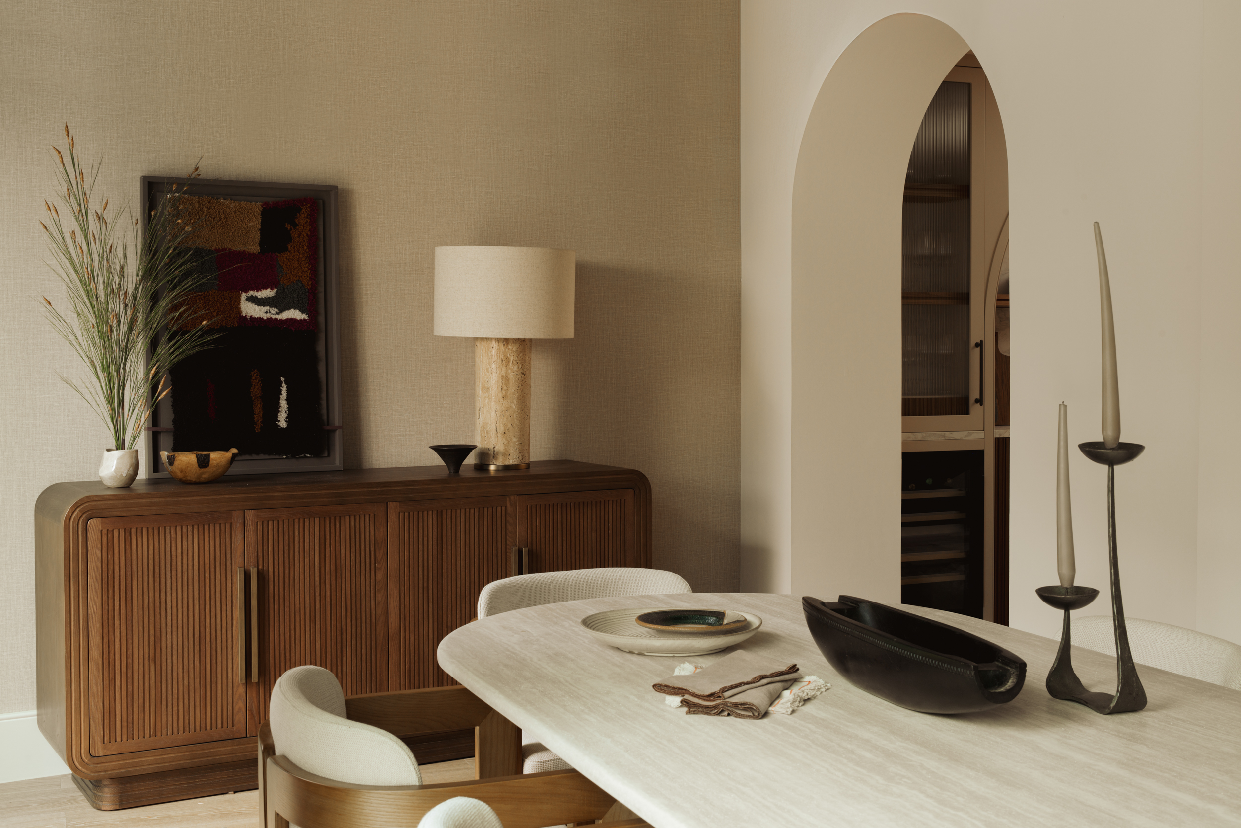
In practice, this is where bespoke joinery becomes one of our most powerful tools. Adding a run of panelling to a featureless hallway, introducing a coffered ceiling to a flat-ceilinged reception room, or framing a kitchen in carefully detailed cabinetry with varied finishes -- these are all ways of building textural complexity into a space that the developer never provided. We are essentially writing the architectural history that the building was never given. Done well, you would not know it was not always there.
The other approach we take with new builds is to be bold with surface finishes from the outset. Rather than painting every wall the same shade and hoping the furniture does the work, we specify textured wall treatments -- limewash, micro-cement, tactile plasters -- as part of the core material palette. We layer in stone, timber, woven textiles and metal from the very first conversation. A new build does not have to feel like a new build. With the right approach to texture, it can feel like a home that has been lived in, loved and considered for decades.
The Hierarchy Rule: How to Layer Texture Without Losing the Room
I remember standing in a sitting room in Alderley Edge a few years ago, trying to work out why a client's beautifully furnished space felt so unsettled. The sofa was excellent. The rug was expensive. The artwork was considered. But the room had no anchor. Looking more carefully, I counted seven different textures of roughly equal visual weight, all competing for attention at the same time. It was like a conversation where everyone is talking at once. My job that day was not to add more. It was to edit.
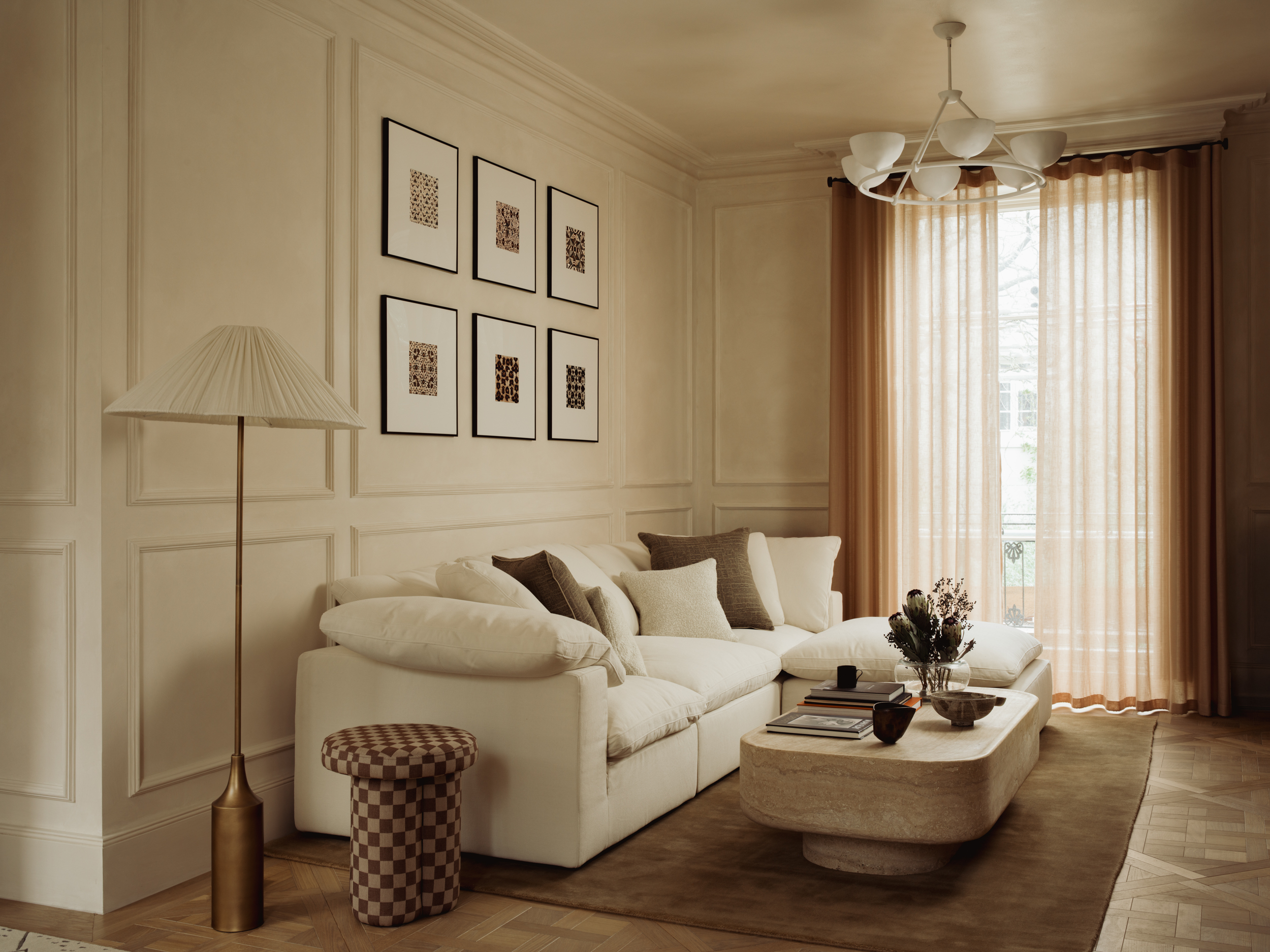
The answer, in my experience, is to think in terms of a hierarchy. You want one or two dominant textures that establish the character of the room, then secondary textures that complement rather than compete, and then accent textures that provide moments of contrast and surprise.
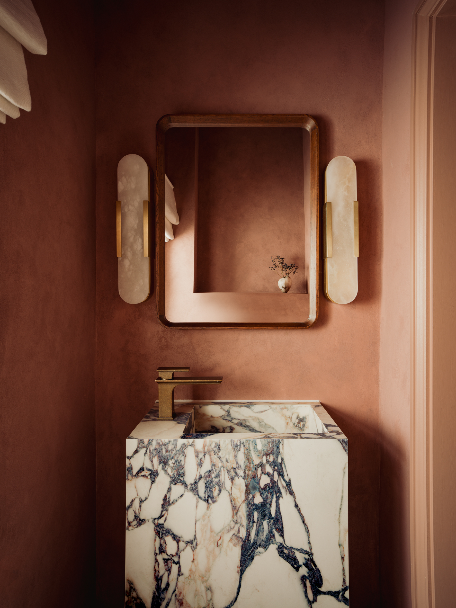
In a sitting room, for instance, the dominant texture might be a natural plaster wall finish and an oak floor. The secondary textures could come through in the upholstery fabrics and a woven rug. The accent texture might be a single piece of stone, perhaps a fireplace surround, or an aged-brass light fitting with a hammered finish.
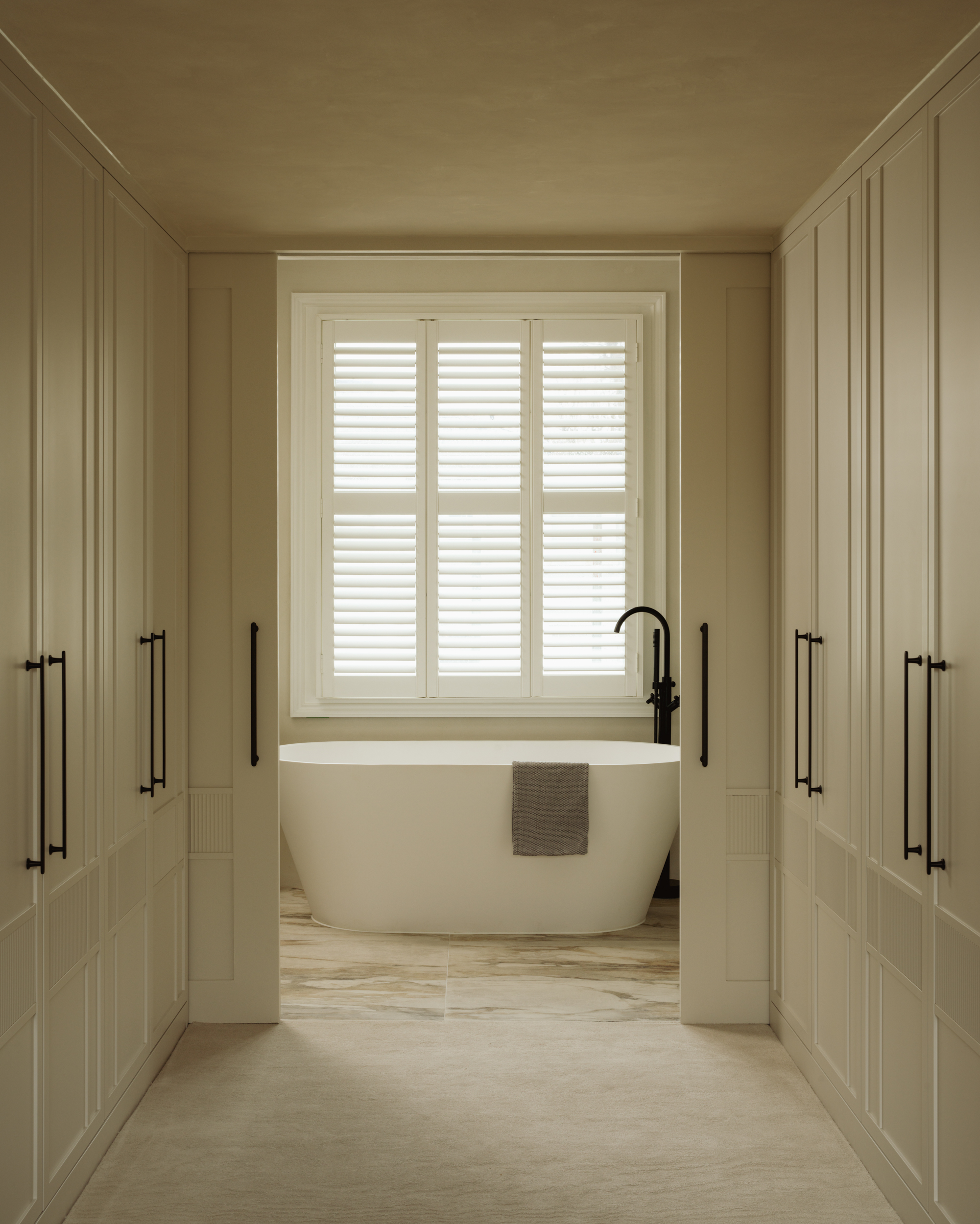
In terms of the actual materials we reach for most often at TXTURED: micro-cement for floors and walls where you want warmth with a contemporary edge; Venetian plaster when you need depth and a surface that genuinely shifts in different lights; honed limestone for kitchen and bathroom surfaces where you want stone that feels lived-in rather than pristine; smoked or limed oak for bespoke joinery where the grain itself becomes part of the textural conversation; and unlacquered brass or blackened steel for hardware and light fittings that age and develop character over time. These are not trend-driven choices. They are materials that earn their place in a room and improve with the years.
The other principle I come back to again and again is the rule of contrast. Smooth needs rough. Hard needs soft. Matt needs a moment of sheen. When every material in a room sits at the same point on the textural spectrum, the space loses its energy. It is the contrast that creates the tension, and tension, used well, is what makes a room feel alive.
Three Mistakes That Kill Texture in an Otherwise Good Room
After years of walking into rooms that are not quite working, the same patterns come up repeatedly. These are the three I see most often.
The first is over-reliance on paint. Paint is important, but it is one of the thinnest tools in the textural kit. When the entire conversation about a room starts and ends with colour, the surfaces themselves are neglected. A beautifully chosen paint colour on a flat plasterboard wall is still a flat plasterboard wall. The finish matters as much as the shade.
The second is matching rather than contrasting. There is a temptation, particularly in new builds, to keep everything consistent: same tone, same material finish, same level of sheen across every surface. It feels safe. It is also the fastest route to a room that feels like a hotel corridor. Rooms need contrast to have life. The moment you introduce one rough surface into a smooth room, or one matt element into a glossy one, the whole space wakes up.
The third is treating texture as decoration rather than architecture. Throwing a jute rug and a couple of cushions at a room is not the same as building a textural foundation. Texture should be considered from the walls and floors outward, not added as an afterthought once the main decisions have been made. By the time you are accessorising, the textural character of the space should already be in place.
Ready to Bring Your Home to Life? Let's Talk.
If any of this resonates, and you find yourself thinking about a room in your home that has never quite worked despite everything being technically right, I would genuinely love to hear from you.
TXTURED is a high-end, turnkey interior design service operating across Cheshire, including Hale, Wilmslow and the surrounding areas. We handle everything from initial concept through to final installation, including bespoke joinery, material specification, period home renovation and full project management. You are not managing trades, chasing timelines or making decisions in isolation. That is our job.
The conversations I enjoy most are the ones where a client says, "I know something is wrong but I cannot put my finger on it." That is exactly the kind of problem we are set up to solve.
Whether you are starting with a single room or planning a full renovation of a period property, get in touch and let us show you what is possible when texture is taken seriously. Because the rooms you never want to leave are never an accident. They are the result of someone caring deeply about every surface you touch, and every surface that touches you back.
Contact TXTURED to start the conversation.
Texture in Interior Design: Your Questions Answered
What does texture mean in interior design and why does it matter?
Texture in interior design refers to the surface quality of materials in a space, both how they feel physically and how they appear visually. It matters because texture gives a room depth, warmth and personality. Without it, even a beautifully furnished space can feel flat or sterile. It is often the element that separates a room that looks good in a photograph from one that genuinely feels exceptional to live in.
How do I add texture to a room without making it look cluttered?
The key is to work with a hierarchy. Choose one or two dominant textures that set the tone for the space, then layer in complementary materials at a secondary level. Avoid using too many textures of equal visual weight, as they will compete rather than converse. Think in terms of contrast: rough against smooth, matt against sheen, soft against hard.
What are the best textured wall finishes for a period home renovation?
For period homes, limewash paint, hand-applied plaster finishes and textured renders all work beautifully because they have a depth and irregularity that complements original architectural features. These finishes also respond to natural light in a way that changes throughout the day, giving walls a living quality that flat emulsions simply cannot achieve.
How does bespoke joinery add texture to an interior?
Bespoke joinery introduces texture through the choice of timber, the finish applied to it, the profiles of mouldings, and the craftsmanship of the piece overall. A well-designed piece of joinery can anchor the textural language of an entire room. It can also be designed to echo existing architectural details in a period property, creating a sense of continuity and authenticity that off-the-shelf furniture never achieves.
Consider a run of painted cabinetry in a kitchen: the difference between a flat-fronted door in a satin finish and a shaker door in an eggshell finish is not just visual -- it changes the entire feel of the room. Add an oak shelf with a live edge above it, and you have introduced a third texture that makes both the cabinet and the shelf work harder. That is joinery doing what it does best: building textural complexity from the inside out.
Is texture in interior design more important than colour?
The two work together rather than competing, but texture is often the more underestimated of the two. Colour is usually the first thing people consider and the first thing that gets changed if a room is not working. But many rooms that feel "off" have perfectly good colour palettes. The issue is textural monotony. Getting the textural balance right can transform a space even before you address colour.