Earthy hues, soft curves and the return of real luxury: how homes will look in 2026
Simon Mayhew, founder of TXTURED, on warmer, more tactile interiors and the simple shifts that bring a 2026 feel without a full renovation.
When the Country Living team asked me to share my predictions for 2026, it opened up a bigger conversation I’m already having with clients. We’re moving away from anything overly glossy or performative, and towards homes that feel authentic, tactile and built to last.
Put simply: warmth over stark minimalism, texture over shine, and rooms that feel lived in, not styled for a photograph.
Think honed stone instead of high gloss surfaces, warm olives instead of crisp grey greens, and lighting that feels like 6pm in a boutique hotel, not a showroom at noon.
Interior design trends for 2026, in a nutshell

If you’ve been searching for interior design trends 2026 (especially for UK homes), here’s the core shift: calmer colour, richer materials, softer shapes and better lighting. It’s less about “what’s new” and more about what feels good to live with, day in, day out.
This isn’t a trend list for the sake of it. It’s what these shifts mean in real homes, and how to bring them in in a way that still feels like you.
What’s driving the shift (in real homes)
A few practical things are pushing this change, beyond what looks good online:
• UK light is unforgiving. Cool whites and crisp greys can read flat and clinical, especially in north facing rooms.
• We’re designing for wellbeing, not just aesthetics. People want spaces that restore them at the end of the day.
• Longevity matters again. Materials with patina age better than perfection and they’re far more forgiving in busy homes.
2026, in one line: comfort with character.
The 2026 look: quick summary
• Warm, grounded colour (nature led, not shouty)
• Matt, tactile finishes (honed, brushed, woven)
• Softer shapes (curves as a design language)
• Layered lighting plus scent as the “invisible finish”
Colour in 2026: warm, grounded and emotionally intelligent
If 2024 and 2025 played with bolder colour moments, 2026 feels more settled, rooted in nature and designed to calm rather than shout. Three shades lead the way:
Golden ochre builds on the sunny yellows that have been quietly creeping in, but feels richer and more mature. In softer British light, it lifts a space without demanding attention, especially in a chalky matt finish (high sheen makes it feel louder).
Where it works best:
• Living rooms as a single mood wall with warm off whites and timber
• Dining rooms and snugs where you want an enveloping glow
• Smaller hits through lampshades, artwork or upholstery if you’re easing in
Light olive green speaks to our need for calm and connection to nature. It’s less a trend led statement, more a quiet countryside exhale, particularly beautiful with aged brass and warm toned stone.
Where it works best:
• Bedrooms and studies for focus and calm
• Kitchens with natural stone, warm metals and timber
• Any room you want to ground without going dark
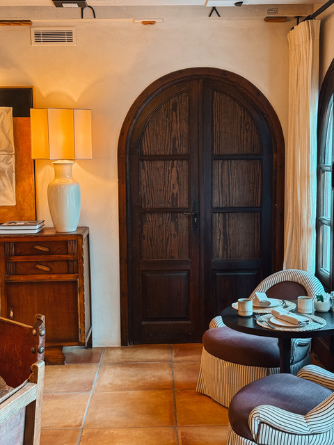
Beige brown is the anchor that makes everything else feel intentional. It replaces cool “greige” with something warmer and more forgiving. It’s timeless, and it suits homes where real life actually happens.
Where it works best:
• Hallways and open plan spaces to create flow
• Backdrops for layered lighting and textured fabrics
• Family rooms where warmth matters and scuffs are inevitable
Together, these tones create interiors that feel calm, secure and quietly confident: soft, human, and made to live in.
Texture and materials: the new luxury is what you can feel

Colour is only part of it. The bigger shift is that we’re designing for the senses, not just the camera.
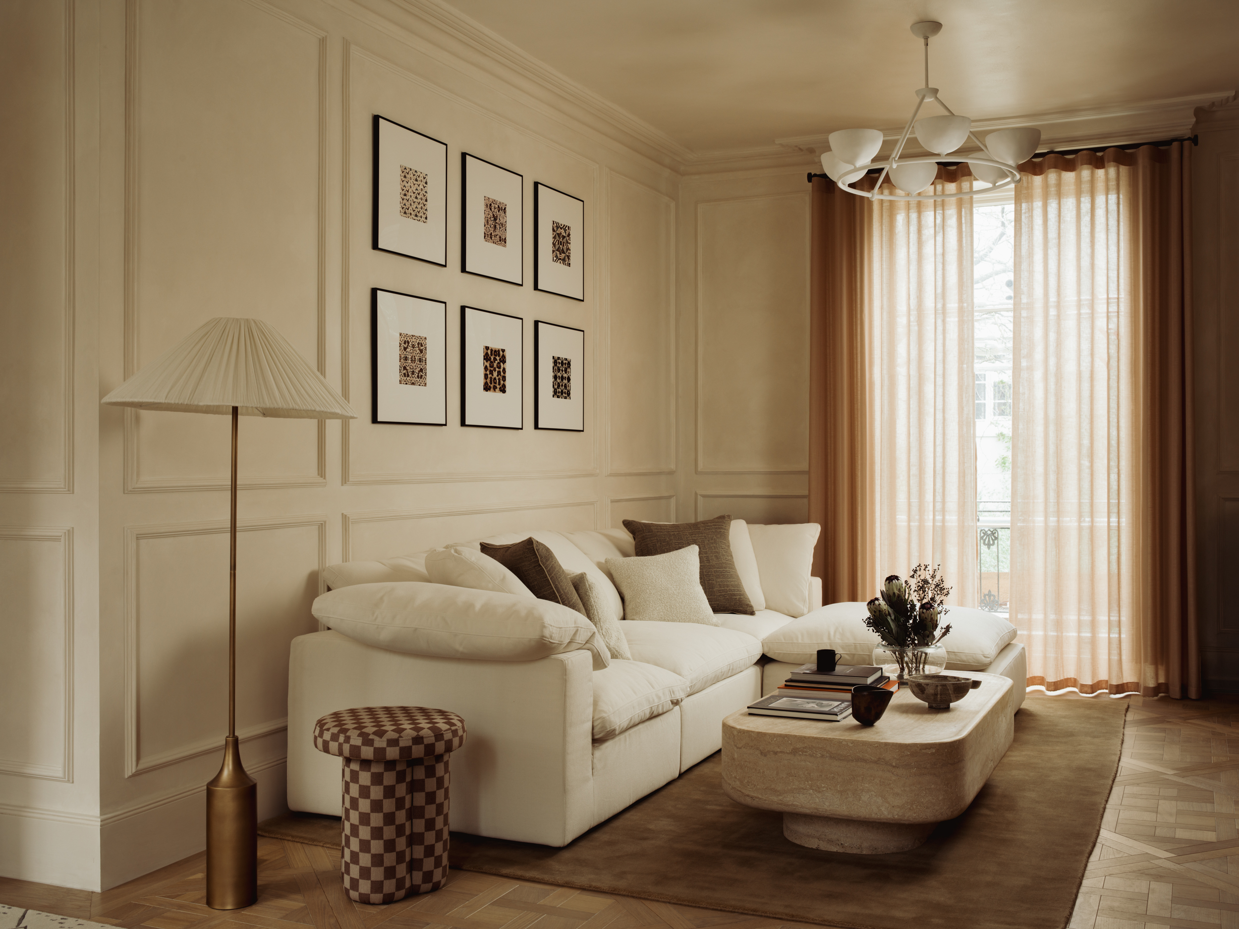
That’s why tactile materials are everywhere: bouclé, chenille, fluted timber, honed stone, aged metals, limewash and woven natural fibres. They add depth without clutter, and they make a quieter palette feel genuinely luxurious.
At TXTURED, we often layer wood with statement stone, then soften it with patinated metals and natural textiles. The result feels soulful and inviting, not sterile or showroom perfect.
Here’s what texture is doing in 2026, and how to use it...
1. It makes neutrals feel expensive
A beige room can feel flat, or it can feel elevated. Texture is the difference.
Try this:
• Swap one shiny surface for a matt or honed finish (hardware, stone, paint)
• Add one textured hero piece: a bouclé chair, chunky wool rug, ribbed sideboard or lime washed wall
2. It calms a room without stripping it back
When pattern and colour do all the work, a space can start to feel visually busy. Texture gives richness with less noise.
Try this:
• Keep the palette tight and layer materials: timber plus wool plus linen plus ceramic
• Go tone on tone with cushions and throws, and vary the weave, not the colour.
3. It ages better than fast finishes
Ultra glossy, ultra crisp schemes date quickly. Natural materials (or high quality alternatives) with softness and movement improve over time.
Try this:
• Choose brushed or aged metals instead of high polish
• Pick stone with warmth and variation. Avoid anything too uniform that can feel “printed”
4. It supports real life
Textured interiors are forgiving. They don’t demand perfection to look good.
Try this:
• Use performance fabrics that still feel soft and elevated
• Warm up open plan spaces with layered lighting and tactile surfaces, especially where you touch most: island fronts, handles, bedside tables, vanity units
Scent in 2026: the invisible layer that finishes a home
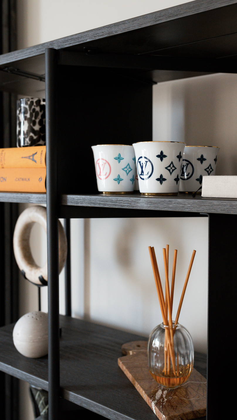
Scent is often the first thing you notice in a room. It anchors memory and sets the mood before you’ve taken anything in visually.
Used well, fragrance supports your design story. It adds warmth, identity and intention, without adding visual clutter. (If you want to go deeper on this, we’ve written more on it here: How scent creates memory.)
Place scent with intent
• Entrance: set your signature here, around nose height near gentle airflow
• Living room: warmer woods or amber, especially in the evenings
• Kitchen and dining: keep it clean so it won’t compete with food
• Bedrooms: soft woods and linen notes, low intensity for rest
• Bathrooms: crisp and bright: citrus, eucalyptus, mint
Choose the right delivery
• Reed diffuser: low maintenance background scent (rotate reeds weekly; refresh every 8 to 10 weeks)
• Candle: best for evenings and hosting (burn around two hours so it pools evenly; trim wick each time)
• Room spray: a quick reset before guests arrive (two or three sprays is enough)
Keep it simple: use one signature through your entrance and main living spaces, then lighter variations in private rooms. Consistency is what makes a home feel finished.
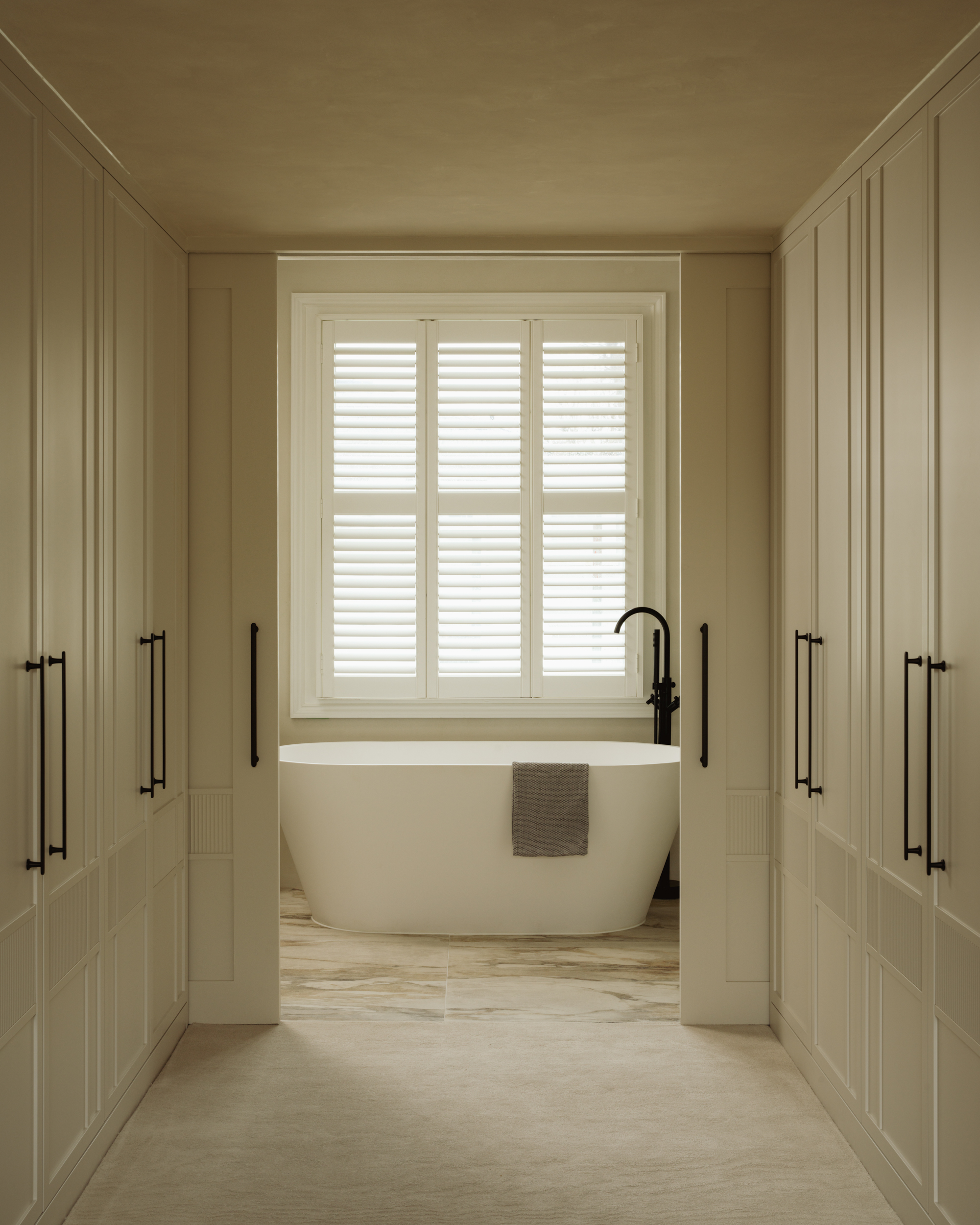
Shape in 2026: why curves are still rising
Curves are no longer a moment, they’re becoming a design language.
Rounded forms soften a space, encourage flow, and make rooms feel more welcoming. In a world that feels sharp and fast, curves read as instinctively human.
What curves change in a space:
• They reduce harshness, especially in boxier layouts
• They guide the eye more gently, creating flow
• They feel more social. Round tables and curved seating invite conversation
• They balance strong materials. Timber, stone and metal soften with rounded edges
Easy ways to add curves without replacing everything:
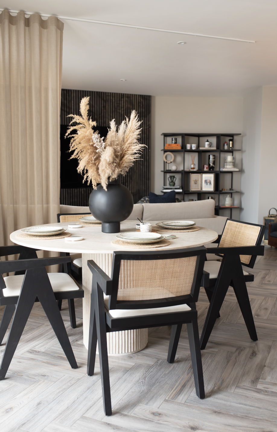
• Swap a rectangular coffee table for an oval or round one
• Add one curved accent chair
• Choose a round mirror in the hallway
• Bring in arched shapes through lighting or headboards
• If renovating: consider a softly curved island end, curved plasterwork, or rounded fluted cabinetry
One note: curves work best when they’re balanced. Too many rounded pieces can start to feel theme y. The trick is contrast: straight with curved, smooth with textured.
Curves land especially well when paired with texture. A rounded silhouette in bouclé, or curved walnut against honed stone, is exactly the 2026 feeling: warm, tactile, quietly confident.
Spend vs Save: the 2026 update without a full renovation
If you want the look and feel without turning your home into a building site:
Spend (where it shows):
• Statement lighting (it changes everything, day and night)
• Quality hardware (brushed and aged finishes elevate instantly)
• A tactile “hero” material: honed stone, beautiful timber, or a standout textile piece
Save (high impact, low disruption):
• Paint (warm neutrals and earthy tones do the heavy lifting)
• Bulbs (switch to warmer temperatures and layer your lighting)
• Soft furnishings (textured cushions, throws, rugs)
• Scent (a signature diffuser or candle instantly finishes a space)
Ready to explore this properly in your own home?
If these ideas are resonating and you’re ready to move on from cool, anonymous interiors, this is exactly the kind of shift we design for at TXTURED.
Book a consultation and we’ll help you shape a home that feels warmer, more tactile and made to last, with longevity at the centre of every decision. For more inspiration, take a look at our projects.

FAQ: interior trends for 2026 and how to use them at home
Do I need to redo my whole house to feel current for 2026?
No. The best homes evolve gradually. Start with the principles: warmer colour, richer texture, softer lighting, and a considered scent story. Even small shifts can change how a home feels.
Are earthy colours just another passing trend?
Earth based palettes are timeless because they come from nature and appear in many historic buildings we love. What’s changing is the mix: richer browns and softer greens replacing cool greys and harsh whites.
Can I still keep some white in my home?
Yes, I’d just steer you towards warm off whites and soft stone tones instead of brilliant white. They sit better with ochre, olive and beige brown, and feel calmer in real light.
How do curves work with furniture I already own?
You don’t need to replace everything. One curved piece, an armchair, a round side table, an arched floor lamp, can balance a room of straighter lines. Contrast is the trick: straight with curved, smooth with textured.
What’s the simplest change I can make this weekend?
Paint is still the fastest transformation. Choose a warm neutral or earthy tone, and consider painting skirting and doors in the same colour family so the room feels calmer and more considered. If you’re not ready for paint, switch to warmer bulbs and add a candle in a scent you genuinely love.
How do I follow trends without losing my personality?
Use trends as a lens, not a rule book. Keep what supports how you want to live, and ignore what doesn’t. The best interiors are always personal, never generic.