Colour Trends for 2026: Simon Mayhew’s Expert Predictions
Colour Paint Trends for 2026: Designing Homes with Warmth & Meaning
As we look ahead to 2026,colour in British interiors is moving in a more thoughtful, human and emotionally aware direction. I was recently invited to share my perspective on this shift for a Country Living feature exploring colour paint trends for 2026, which offered a valuable moment to reflect on what clients are genuinely asking for right now.
You can read the full article here.
At TXTURED, whether we are renovating a period home in Cheshire or designing a contemporary city apartment in Manchester, one thing remains consistent. People want homes that feel visually reassuring, grounded and deeply liveable. Colour plays a central role in achieving that sense of ease.
If you are already rethinking your colour palette for 2026, this is exactly the kind of shift we guide our clients through as part of our turnkey design process.
Warm, Grounded Colour Takes Centre Stage in 2026
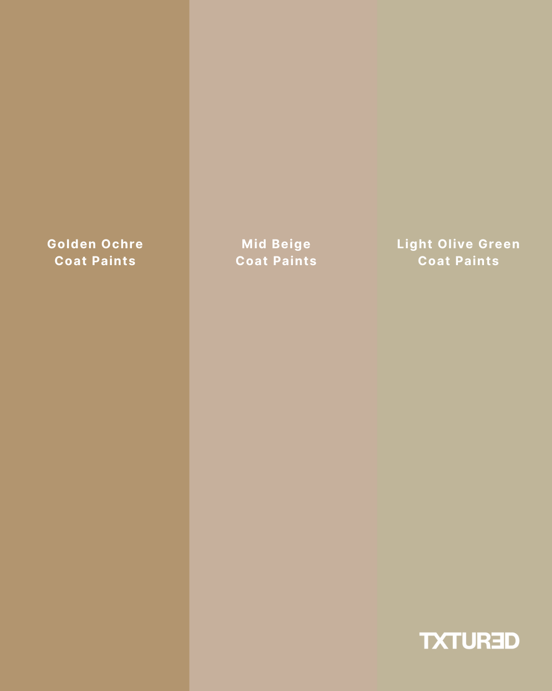
As we move into 2026, British interiors are leaning strongly towards warmer, more grounded colour palettes that feel supportive of everyday life. Three shades in particular are shaping the next chapter of interior design: golden ochre, light olive green and beige brown.
This marks a clear shift away from the cool, crisp and often anonymous schemes that dominated interiors for many years. Instead, clients are choosing colours that feel emotionally intelligent, offering comfort, balance and a sense of connection.
Golden Ochre: Optimism with Depth
Golden ochre feels like a natural evolution of the sunny yellows that have been quietly growing in popularity. It is richer, earthier and more layered, which immediately gives it a sense of depth and quiet confidence.
In soft British light, golden ochre brings warmth without overpowering a space. It lifts a room both visually and emotionally, offering an understated optimism that feels calm rather than attention seeking.
We recently introduced a soft golden ochre tone into a north-facing Cheshire living space, and the transformation was immediate. The room felt brighter, warmer and far more welcoming, without losing its sense of refinement.
Throughout our luxury interior design projects, clients are increasingly drawn to this kind of warmth in place of stark minimalism. Used thoughtfully, golden ochre works beautifully in living rooms, kitchens and snug spaces, particularly when paired with bespoke joinery, natural stone and tactile finishes.

Light Olive Green: Calm, Restorative and Timeless
Light olive green reflects an ongoing desire for calm and a closer connection to nature. The greens being used now are softer and more nuanced than the sharper sage and emerald tones of previous years.
Olive green feels balanced and restorative, bringing a sense of countryside ease into urban homes. It works especially well in bedrooms, kitchens and dining spaces, where comfort, flow and longevity matter most.
For period home renovations and character properties across Cheshire, Hale and Wilmslow, olive green offers a timeless backdrop that respects original architecture while still feeling current. It has a natural ability to sit quietly within a space while enhancing its character.
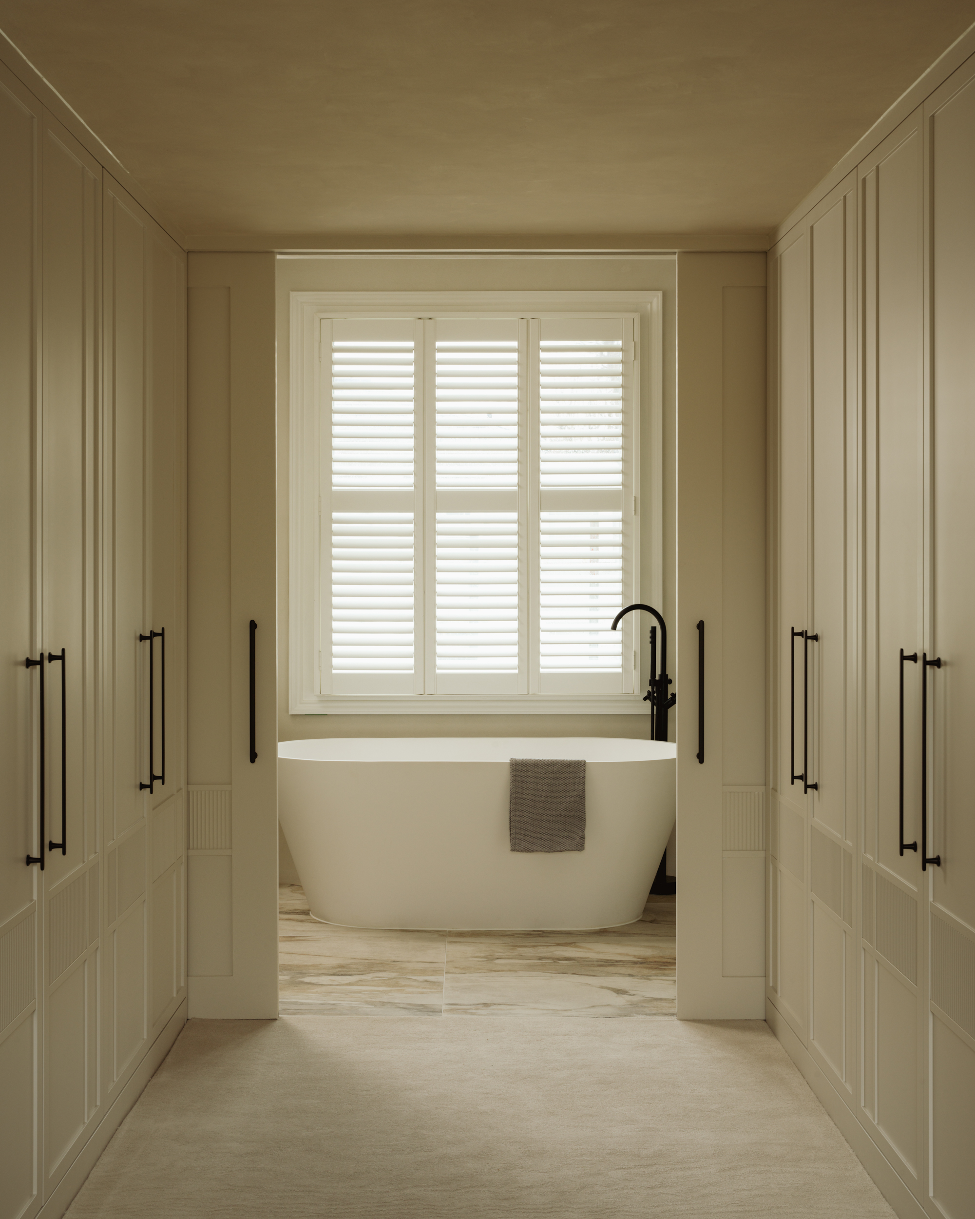
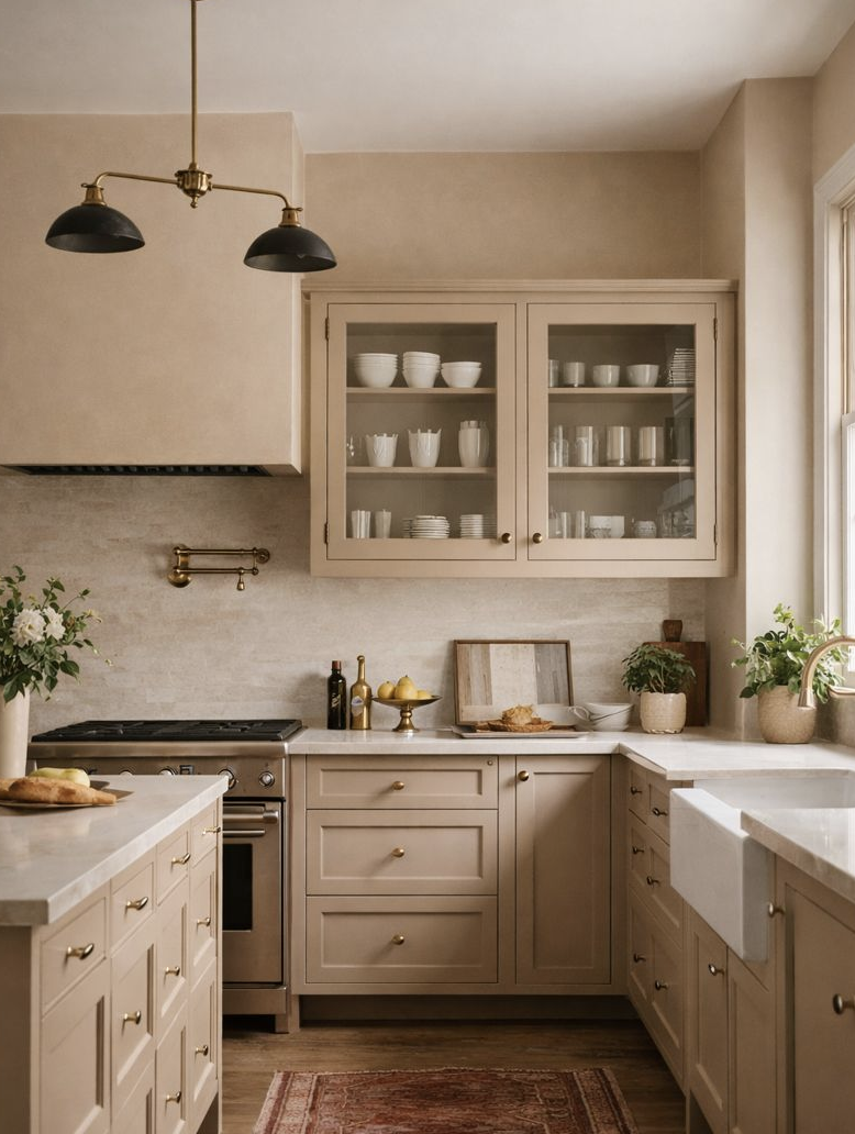
Beige Brown: The New Neutral Anchor
Beige brown is the quiet anchor of the 2026 colour palette. It moves us away from cooler greige tones towards something warmer, softer and more tactile.
These shades create a cocooning, visually calm backdrop that feels stable and enduring. They are particularly well suited to busy homes where real life happens, while still allowing bespoke cabinetry, artwork and texture to take centre stage.
In many TXTURED projects, beige brown walls provide a steady foundation that allows layered interiors to feel cohesive, considered and timeless over the long term.
Comfort with Character: The Defining Mood for 2026
Together, golden ochre, light olive green and beige brown define a new direction for interiors in 2026. Homes that feel warm, secure and connected to nature, with a sense of lived-in sophistication.
At TXTURED, this is exactly what clients are asking for. There is a clear move away from cool and impersonal schemes towards spaces that feel softer, more personal and quietly confident.
Whether we are designing a family home in Cheshire or creating a refined interior elsewhere in the UK, one thing is clear. Comfort with character will define interiors in 2026.
Ready to Explore Colour Trends Properly in Your Own Home
If these colour trends are resonating and you are ready to move away from cool and impersonal interiors, this is exactly the kind of shift we design for at TXTURED.
Book a consultation here.
We will help you build a considered colour palette that brings warmth, depth and longevity to your home.Every shade is chosen to work beautifully with your space, natural light and lifestyle.
For more inspiration, explore our latest projects.
Choosing the Right Paint Colours for Your Home: Your questions Answered
How do I choose the right paint palette for my home?
Start with how you want the space to feel. Mood, natural light, architecture and how the room is used should guide every colour decision.
How many colours should I use throughout my home?
Most homes work best with three to five core colours. This creates variation between rooms while maintaining a strong sense of cohesion.
How does natural light affect paint colours?
Natural light changes colour dramatically. North-facing rooms often benefit from warmer tones, while south-facing spaces can handle deeper shades with ease.
Are warm colours suitable for modern interiors?
Yes. Warm colours such as golden ochre, olive green and beige brown add depth and sophistication to modern spaces when paired with clean lines and natural materials.
Should I follow colour trends or play it safe?
Trends are best used as inspiration rather than rules. Longevity should always come before fashion, especially in spaces you live with every day.
Can one colour work throughout an entire house?
Yes, but variation matters. Using different tones or finishes of the same colour creates continuity without feeling flat or repetitive.