Kitchen Worktop Trends for 2026: A Designer’s Guide
The 2026 Worktop Trend Shift: Why Warmth is Replacing Cool Grey
Winter has a way of pulling us back into the kitchen. In December, the kettle is constantly on, the oven earns its keep and the kitchen becomes the backdrop to everything from quiet weekday dinners to full-on Christmas hosting.
It’s also the season when people look around their homes with fresh eyes. Maybe you’re planning are novation for the new year, or maybe you’re just noticing what feels a bit tired now you’re spending more time indoors. Either way, your countertop (or worktop, as we tend to call it here in the UK) starts to matter in a bigger way. It’s not just a surface. It sets the emotional tone of the whole room.
If you're planning a kitchen as part of a wider renovation or new build, download our process guide to see how TXTURED works from concept to completion.
At a glance: what’s changing
If you’re choosing a worktop for a kitchen starting in 2026, here’s the direction:
• Cool + flat is giving way to warm + textured.
• High-contrast “showroom perfect” finishes are softening into lived-in, characterful surfaces.
• Sustainability and subtle individuality are becoming non-negotiables.
A quick nod to Livingetc (and why this matters now)
We were really pleased to contribute to a recent Livingetc online feature by Maya Glantz: “5 Countertop Colors That Are Going Out of Style, and What You Should Choose Instead — According to Kitchen Designers.” The big takeaway was clear: cool, high-contrast finishes are giving way to warmer, more relaxed surfaces.
This post expands on those comments with more context and practical guidance for anyone planning a kitchen now. So grab yourself a cup of coffee, and keep scrolling!
The trend shift: what’s changing and why
Over the last couple of years, we’ve seen a clear move away from crisp, cool finishes and toward kitchens that feel softer, warmer and more personal.
That shift isn’t random. It comes from how people want their homes to feel.
Clients aren’t asking for kitchens that look perfect only in a photo. They want spaces that welcome them home at 6pm on a dark wintery Tuesday and still feel special on Christmas morning. That means more depth, more tactility and more warmth.
What’s going out of style (gently, no judgement)
If you already have any of these and you love them, keep loving them. Good design is personal. But if you’re choosing now, these finishes are starting to feel less current in real homes:
- Cool mid-tone greys
The silvery-concrete quartz family and flat cool composites that dominated kitchens for a decade are on the wane. In winter daylight they can read lifeless, and in softer light they often feel cold. - Bright, clinical whites
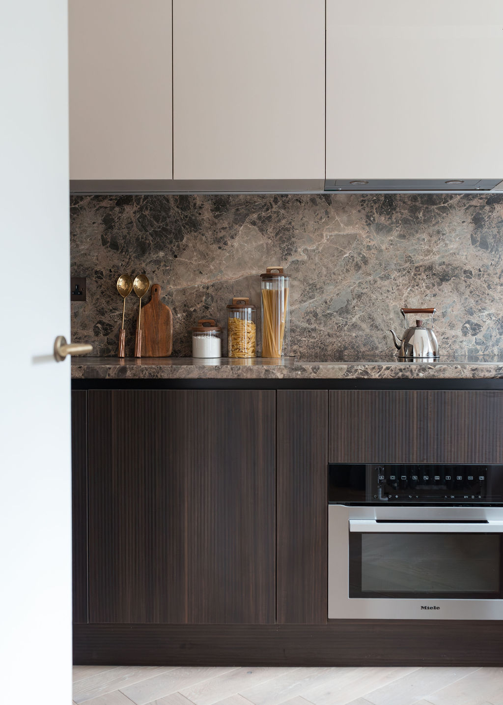
Ultra-white, high-gloss “pure snow” tops used to mean modern and clean. Now they can feel stark, and they show everything. In a kitchen that’s regularly used, that’s a daily irritation. - Heavy, speckled dark granite
Dense black/brown granites with strong flecking tend to dominate rather than support the room. They push a kitchen toward a more polished, old-school look and don’t sit as naturally with today’s layered, calmer interiors.
What to choose instead
The best replacements aren’t about chasing a look. They’re about choosing surfaces that feel inviting now and still make sense five or ten years down the line.
→ Warmer neutrals
Think taupe, sand, clay, soft biscuit and gentle mushroom tones. These pair beautifully with oak, warm whites, olive greens, inky navies and mixed metals like brushed brass or aged bronze. They also make kitchens feel naturally welcoming, which is exactly what many TXTURED clients are asking for right now.
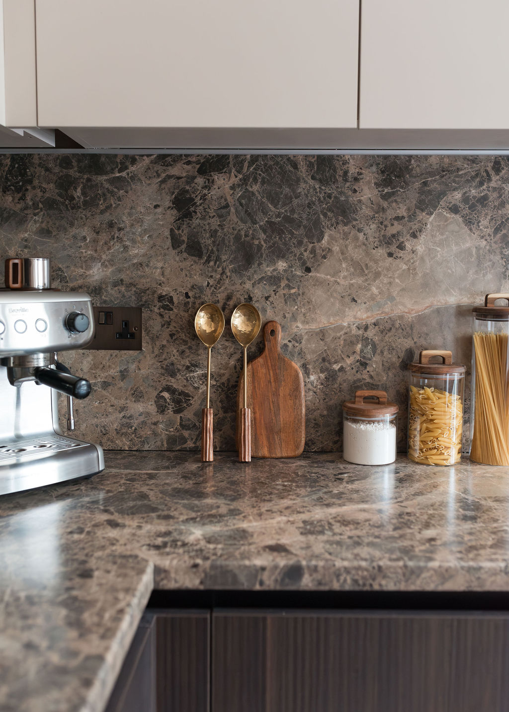
→ Warm stones with movement
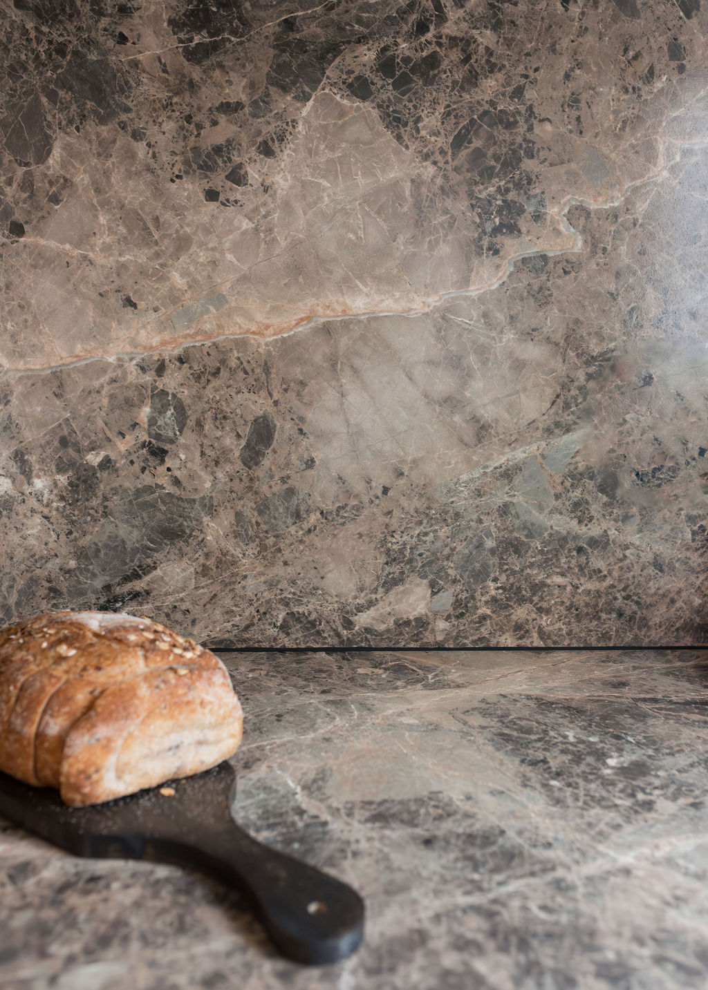
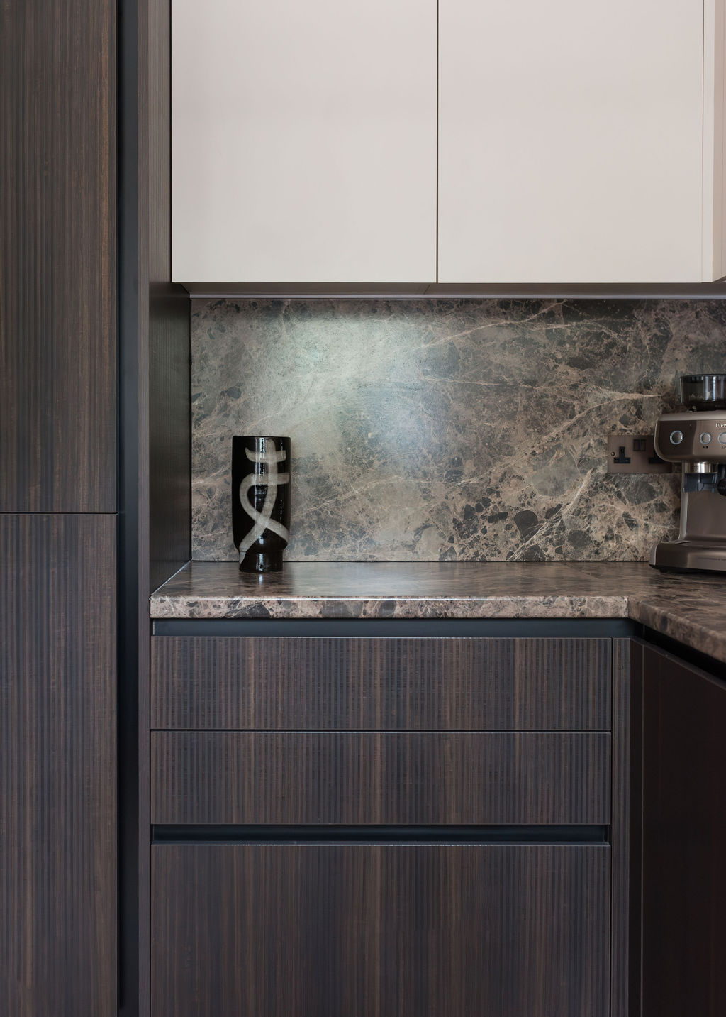
Subtle veining and organic texture add depth without shouting. Travertine-toned quartzites, warmer marbles and earth-leaning limestones are all coming through strongly.
Rosso Levanto marble is a great example of a richer statement stone that still feels classic, especially with warm white cabinetry and deep greens. Up close, movement reads as character, not chaos. That’s what ages well.
→ Terrazzo + lower-impact composites
Terrazzo is having a proper resurgence because it brings pattern in a grounded, soft way. Plus, it’s practical. It hides crumbs and daily marks better than flat finishes. Many modern versions use recycled content, and we’re also seeing growing appetite for recycled composites and lower-impact surfaces.
Individuality + sustainability is a strong combination for 2026 kitchens.
→ Quietly bold deeper tones
Deeper countertop colours are creeping in: forest greens, smoked olives, oxbloods and soft burgundies. Used thoughtfully, they add mood and richness without tipping into trend-for-trend’s-sake.
Watch-out: if you go bolder on the top, keep the rest of the palette calm so the countertop is a hero, not a headache.
How to pick the right countertop for your kitchen
A countertop doesn’t exist in isolation. These are the checks we always run through with clients:
- Look at your lighting
North-facing kitchens and winter-heavy daylight soften colours. Warm, textured surfaces usually hold up better than cool greys, which can fall flat in real conditions. - Match undertones to cabinetry
If your cabinets are warm white, oak, clay or earthy paint shades, choose a top with warmth to echo that. If cabinetry is darker, a softer neutral top keeps the room balanced. - Be honest about lifestyle
Cook daily, have kids, or host a lot? Prioritise durability and patina-friendly finishes. Honed stone, terrazzo, stainless steel and many composites age with charm rather than stress. - Think about maintenance before you fall in love
A surface can be gorgeous and still wrong for your life. Ask how it stains, scratches and cleans, then decide whether that trade-off feels worth it.
What we’re seeing in real TXTURED projects
Across recent kitchens we’ve designed and delivered in and around Cheshire, we’re pairing warmer countertops with softer cabinetry and wall colours to create that “come in and stay awhile” feeling.
We’re also using honed finishes more than polished ones. They diffuse light, show fewer marks and feelmore tactile. Clients who once defaulted to grey are now choosing warm stone, terrazzo or richly veined marble because it makes kitchens feel calm, personal and easy to live with.
Closing thoughts: aim for warmth, character, longevity
The direction is clear: warmth over starkness, texture over flatness and surfaces that feel human in everyday light. The goal isn’t to follow trends blindly. It’s to build a kitchen that holds its own through seasons, hosting, and the realities of real life.
If your countertop choice makes the room feel more welcoming on a dark December afternoon, it’s probably a good one.
Ready to take action?
Renovating your home in Cheshire and reworking the kitchen as part of the bigger project? We’d love to help. TXTURED specialises in complete renovations, creating kitchens that make sense within the whole flow of your home.
Enquire here → [link]
FAQ: Worktop colours, materials & choosing well for 2026 (and beyond)
What’s the safest countertop colour if I want longevity?
Warm neutrals with subtle variation are the most timeless right now. Think mushroom, taupe, soft sand, biscuit and clay. They sit quietly in the background but still add softness and depth over time.
Do bold countertops date quickly?
They can if chosen purely because they’re trendy. But quietly bold tones (forest green, oxblood, smoked olive) hold up well when the rest of the kitchen stays calm and layered. Balance is everything!
What finish is most practical for busy family kitchens?
Honed or matt finishes are generally kinder than high-polish. They diffuse light, show fewer fingerprints and water marks and develop character instead of looking worn.
Is marble a bad idea for real kitchens?
It depends on your lifestyle. Marble will patina. That’s part of its charm. But it can etch and mark. If you want the look without the stress, warm quartzites or high-quality composites with movement are brilliant alternatives.
How do I know if a countertop will look good in my kitchen light?
Always view samples in your actual space. North-facing rooms and winter light shift everything cooler and flatter. Warm tones and surfaces with texture tend to read richer and more inviting day to day.